Photo: www.drake.edu
While the majority of students used winter break to relax and detach themselves from studies, some members of the Drake community spent the time completing an intensive project.
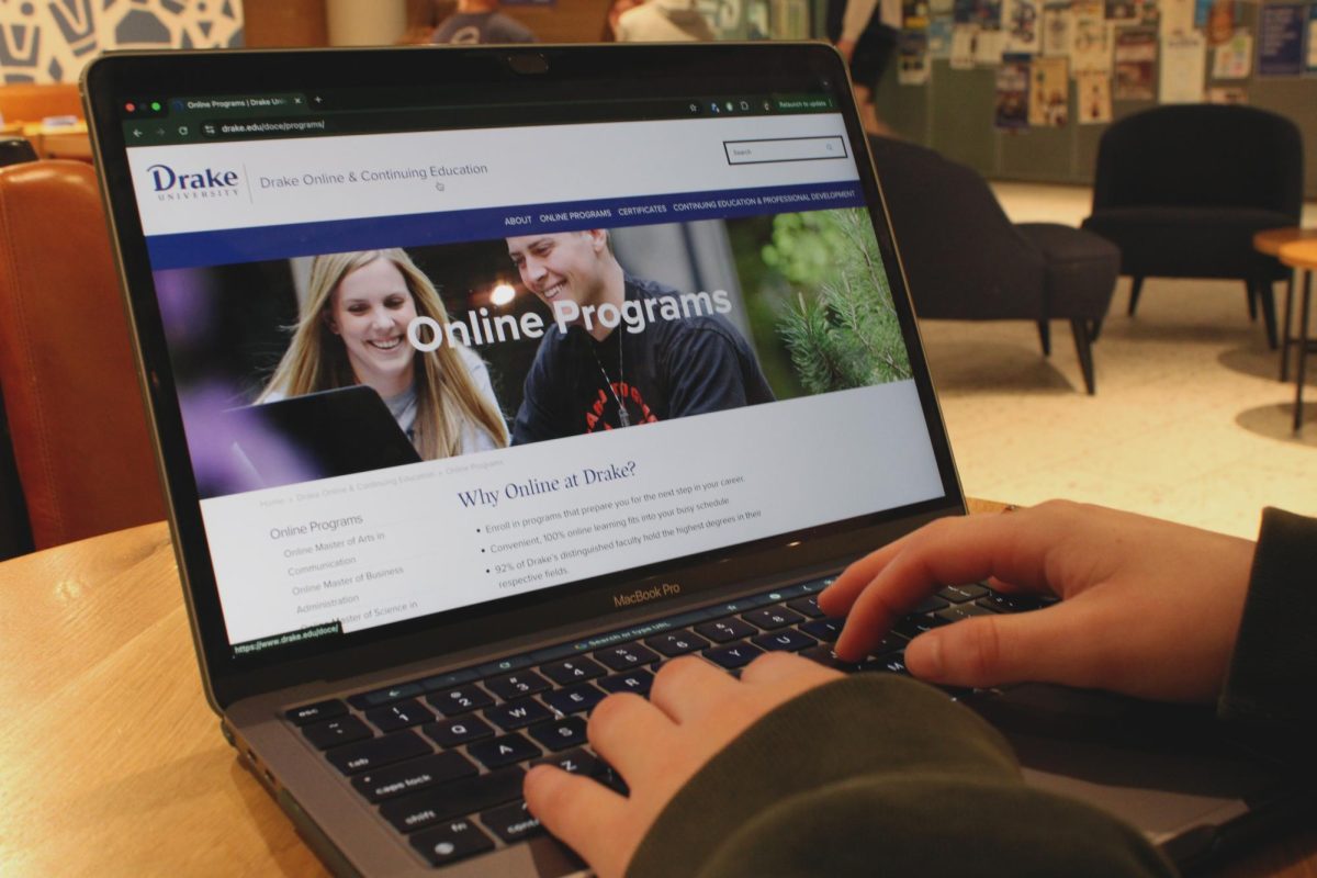
January visitors to the Drake University website caught a first glimpse. The Office of Marketing and Communications unveiled the revamped website before the start of the new semester.
The Office of Marketing and Communications completed the planning, researching and programming of the project solely within its department. The digital media and public relations teams aided in the re-envisioning process. Also, student, faculty and staff interviews and discussions identified additional needs and usage patterns of the website.
“Many of the ideas that came out of those brainstorming meetings have turned into new initiatives we are currently working on for alumni and development, as well as social media,” Director of Web Communications Jeremy Sievers said.
Sievers said discussion about the website redesign began last summer and then developed into a formal project this fall. The department took two months to do initial planning and research and an additional month to finalize programming and development.
The department developed the redesign to address specific aspects of the previous website that hindered efficiency. Sievers said the university home page grew over the last four years with ‘band-aid fixes’ instead of actual solutions.
“The university home page acts as a launching pad, getting users to various content and services,” Sievers said. “Our primary goals were to get more relevant content to users in less time, and to re-envision how we displayed university news.”
Sievers said the department’s most complicated task involved discovering a new way to feature news. Google Analytics sorted through data to reveal that the home page received the most hits. The most effective solution fixed both problems: use the home page to distribute messaging.
The department knew that users do not commonly take more than a few seconds to look at a home page before leaving to click on a different site or page. Sievers said this leaves one chance for a message to get out and leave an impression.
“We took an ambitious approach to have a single feature story that changes weekly, rather than the standard rotating four or five banners most other sites have,” Sievers said. “We opted to spend more time on finding and photographing that one great story than watering down the effort.”
To save users even more time, the website search feature underwent a makeover. In the previous website design, a user needed to click a separate page to begin a search. Sievers said the department added a text entry ‘search’ space that displays on the home page as well as internal pages, with a live campus directory search.
Other additional new features include a drop down constituent navigation, creation of two new news sections for faculty and staff recognition and for Drake news in other media and university social media links located at the top right of the home page.
“Traffic in social media has been overwhelmingly positive. While the chatter has slowed down, common posts focused on the design and applauded the clean, uncluttered look,” Sievers said.
Sievers said the department has seen a dramatic increase in the numbers of people viewing the main feature stories on the home page. Previously, most articles saw 150-250 page views, while the new features are averaging 620 page views.
“One story had over 1,600 page views while class wasn’t even in session,” Sievers said.
A feedback survey specifically for the home page was included in the redesign, located in the left of the footer, to gain more substantive comments, said Sievers. Students, faculty and staff are encouraged to submit their comments.
“The Drake community takes a great deal of pride in its public presence, and left a good deal of constructive comments, many of which we have already taken action on,” Sievers said.


