Design has been a part of my life for around four years now. In that time, I’ve done everything from basic graphic design work to advertising design. When first learning something like logo design, I was taught a few key things: Your logo should work in black and white, one color and full color. Your design should be simple. Your design should be recognizable. With these core things in mind, just looking at the landscape around the designs of today, it’s very easy to see those principles at play.
Design is something I started to love before I even really knew the kind of terms needed to describe what I was doing. It’s been something that I spent a majority of my youth on, and it’s interesting looking back and seeing how things have changed and the way that things are going. We used to use a lot of gradients and more complex design techniques in logos and packaging design. That’s still there to an extent, but for a larger part, most things have started to adopt a newer design language that favors minimalism over most things. This development isn’t new, having started a couple of years ago.
This kind of design really started within companies that are mostly online brands. There is an easy explanation for this — that being that when we design for an online world, we must take into consideration everywhere it will be used. This simplistic design language allows for a more coherent overall brand identity, something very important, especially within a space where staying relevant is key. Companies like Meta, Google and X (formerly known as Twitter) have all been major proponents of this design language both as platforms for other brands and as brands themselves.
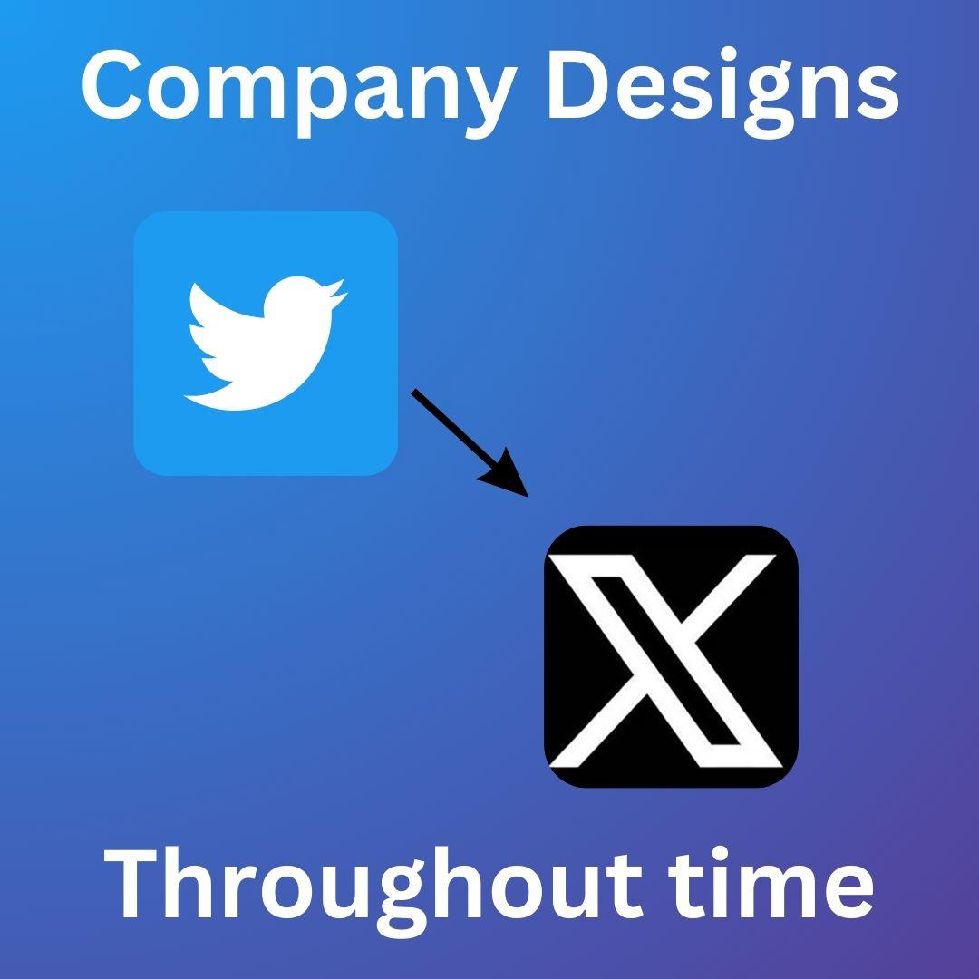
Now let’s talk about X for a second because it’s an interesting case, especially in today’s climate. Twitter was founded in March of 2006 and was just rebranded to X in April of this year. This change is massive for multiple reasons. For one, it really shows that the direction of the company has changed, but I’m more focused on something else. We’re talking about a company that existed before the iPhone. 17 years of brand recognition has now been thrown down the drain. With that all being said, brand recognizability is one thing, but it’s another to overhaul your entire company brand while keeping the product the exact same. Design touches everything when we’re talking about social media and software. There has been no formal overhaul to X’s user interface since the rebranding. I find this a little strange to change your brand image but not your product.
So what do these changes mean for the future of design as a whole? Personally, I’m of the firm belief that design is always changing and moving towards something new. As we continue to move forward in the information age, we’re going to start to see a lot more brands adopting an identity that is more uniform with the rest of corporate America. Design is something that constantly needs to be worked upon, and because of that, I don’t think this is the end for more elaborate designs but a step in the direction of things we’ve never seen before.


